In today’s tech-savvy world, it should come as no surprise that parents use the internet on their phones, tablets, and computers to research potential schools for their children.
After all, this is where most of us find information about local businesses nowadays.
Parents will be searching for information about your school the same way they scope out local businesses and restaurants: performing a search.
But if your school’s website is not optimized properly, how will they find you and learn more about what your school offers?
We understand that website optimization is probably not your thing, but with the help of today’s article, we’ll break it down so it becomes your thing. We’ll teach you how to optimize your school’s website so parents can actually find you and increase your enrollment numbers.
[content_upgrade cu_id=”2044″]Want a checklist to walk you through the optimization process? Download our free one![content_upgrade_button]Click Here[/content_upgrade_button][/content_upgrade]
Website Optimization Overview
What the heck is website optimization anyway?
We’re glad you asked.
Although the name sounds more complex than it is, optimization is simply the process of putting your website in the best position possible to acquire unpaid, organic traffic to your site. That traffic will often include the parents of potential students.
When we refer to unpaid, organic traffic here, we talking about users who find your website via search results instead of clicking on paid ads.
You may have heard the term SEO, or search engine optimization, with regards to website optimization. This is essentially the same thing.
The goal of optimization is making your website as easy to find and use as possible.
This means that when a parent performs a search for local schools in their favorite search engine (Google, Bing, etc.), your school will pop up immediately in the results.
Here’s how you get that to happen.
Make Your Site Easy to Find
Since Google is the most popular search engine, it’s best to start here by creating a Google My Business Page.
Imagine this page as a virtual Yellowbook listing for your school. It’s basically a business directory that will list your school’s address, phone number, and other important details that you plug in.
It’s also a place where parents can leave glowing reviews about your school, but that’s a topic for later down the line.
For now, you’ll need to claim your listing by inputting all of the necessary details that parents need to know about your school.
Bing and Yahoo have their own versions of business directories, so you’ll want to set up the same listings on those sites as well, just in case some of your parents prefer to use those search engines instead.
Pro tip: your business listings should all match, down to the most miniscule of details. If your school is located on Hanson Lane, you’ll want to pick either Ln or Lane and stick with it on every single listing you create, including how it’s presented on your website.
Search engines love consistency, which means this tiny detail could help raise your rankings in search results.
Local directories such as Yellow Pages and Yelp are also good options. You just want to be careful that you don’t sign up for a paid listing since a free one is all you need right now.
Once you’ve added your school’s information to every virtual directory you can find, it’s time to switch gears to focus on your website itself.
Update Your Website So It’s User Friendly
The term ‘user friendly’ means a website “is easily workable and accessible to others.”

Start With Your Navigation
You’ll want to make your website navigation simple so your users are not overwhelmed with too many options when they first land on your site.
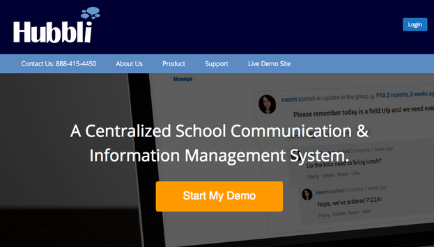
If you take a look at our site as an example, you’ll notice that we have our contact information and four other main pages to choose from at the top of the page (About Us, Product, Support, Live Demo Site). This is considered the navigation.

A good rule of thumb is to choose somewhere between 4–7 options at most.
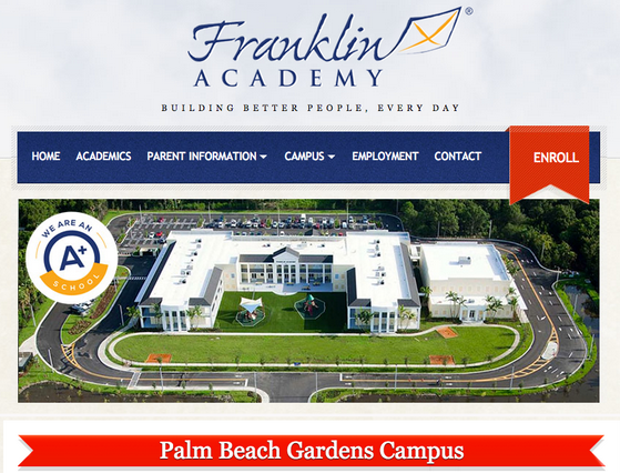
Take a look at this example from a school in Palm Beach Gardens, FL:

This is a perfect example of what an easy-to-use top navigation should look like.
There are six options for parents to choose from, with little triangles to indicate which pages have sub-menus. Plus, you can’t help but notice the eye-catching Enroll button on the right.
Keep the Font Size at 14 or Above
To make things easier for your parents to read, be sure to use a font size of 14 or above for the body text and 18 or above for your headings and menu items.
Break Up Large Paragraphs
Large chunks of text can be hard to read, especially on mobile devices. That’s why it’s always a good idea to use smaller paragraphs that contain anywhere from 2–3 sentences instead.
Keep in mind that parents may be learning about your school on their phones or tablets, which have smaller screens than laptops or desktops.
Big chunks of content can seem daunting and time consuming to read, so by having smaller paragraphs, parents will be able to easily and quickly digest the information.
It’s also a good idea to separate paragraphs using subheadings like we’ve done in this article (Keep the Font Size at 14 or Above, Break Up Large Paragraphs, etc.). This gives your parents the option of scanning the page so they can find exactly what they need in an instant, which makes their lives easier.
Guide Parents with Internal Linking
Remember, our goal is making your website as simple to use as possible. Another way to do this is by using internal links.
Internal linking connects pages within your site. For example, in your About Us page, you could add a link to your Contact page or your Parent Information page (or both) so parents can learn more without having to figure out where to go next.
By guiding parents via internal linking, they’ll know exactly what to do without getting lost.
Keep Contact Information Prominent
You want to make it as easy as possible for parents to get in touch with your school, so displaying pertinent contact information is a must.
In our Franklin Academy example, the Contact page is listed right next to the Enroll button. If parents need more information before they decide to enroll, they have it right there in front of them.
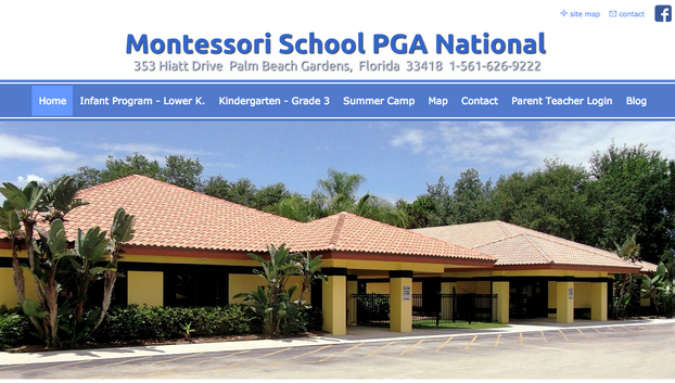
You could also add your school’s phone number and address above the navigation like this school does:

As you can see, this school has their contact information listed underneath their name and even has two more links called ‘Contact’ (upper right hand corner and on the main navigation) making it super easy for parents to get in touch.
You could also add your contact information to the footer of your website.
Be sure to add your phone number and an email address wherever your contact information lives so parents have multiple ways to reach you.
Also, notice that having 8 menu items in this school’s main navigation makes it a bit too crowded, which is why we recommend no more than 7 items.
[content_upgrade cu_id=”2044″]Want a checklist to walk you through the optimization process? Download our free one![content_upgrade_button]Click Here[/content_upgrade_button][/content_upgrade]
Optimize Each Page of Your Site
Search engines like Google and Bing pull data from your website and use it in their list of results.
You’ll want to properly set up each page of your school’s website so that search engines have the right information.
If your school’s site uses WordPress, check out the popular SEO plugin Yoast. Using the free version of this plugin, you’ll be able to fill in important details about each page so your website can be found in searches.
Since this can get a bit complicated, you may want to find someone who has experience with search engine optimization.
If you’re more of a do-it-yourself kind of person, there’s a comprehensive guide here.
But don’t hesitate to ask our team to help you out! We offer website optimization options to make life easier for you and your school. Simply visit this page to learn more.
We hope you’ve learned just how valuable optimizing your school’s website can be.
By taking these few extra steps, parents will be able to find your school’s website in a search and they’ll have no problems using your site when they get there. This may be the first time a parent of a potential student sees what your school is all about, so make it count! After all, we want those enrollment numbers on the rise.

