How frustrating are unresponsive websites that seem to be stuck in the golden age of dial-up?
Navigation can feel like you’re sinking in quicksand and when you finally do get yourself out, the information you were seeking is nowhere to be found. Argh!
I hope I’m not describing your school’s website.
See, if your website isn’t parent-friendly, your administrative team probably fields most of their questions via phone calls and emails, even though the answers are somewhere in the text of your school’s website.
This is a huge waste of time for everyone.
Your school’s website should be a one-stop destination for current and future parents to find information about everything from SAT test dates and enrollment procedures to emergency school closures.
Parent-friendly websites don’t have to be fancy; they just have to convey information effectively.
If you’ve ever felt like your school’s website could be more helpful for parents than it actually is, today’s article will be just the push you need to make some positive changes.
We’ll show you all of our favorite tips for creating school websites that parents love.
[content_upgrade cu_id=”4171″]Bonus: Have you ever conducted a website audit for your school’s site? It’s easier than it sounds! Subscribe now to receive this free how-to guide.[content_upgrade_button]Click Here[/content_upgrade_button][/content_upgrade]
How to Give Parents What They’re Looking for Most
According to a survey of more than 40,000 parents in 50 school districts of 22 states, parents prefer school communication via email, e-newsletters, and the school website over more traditional forms of communication such as telephone messages and backpack flyers.
Ron Koehler, National School Public Relations Association (NSPRA) President, stresses that:
“Consumer needs are changing. The backpack folder is no longer the primary source
of information for parents. They want and prefer instant electronic information… The data
demonstrates parents and non-parents alike turn to the web when they need information, and they want it now.”
If you’re not providing specific, accurate, informative content on your school’s website, parents will not find it useful and will therefore engage with it less often.
This is exactly the opposite effect you want for your school.
You want to give current and potential parents the tools to be self-sufficient so they don’t bog down your administrative staff.
Plus, most parents would actually prefer to find an answer on your website than call you. Give parents a home base to check to find answers on their own.
Here are the top 7 must-haves for a parent-friendly school website:
1. Mobile-Friendly Optimization
A destination website in this day and age has to accommodate visitors from mobile devices such as cell phones and tablets.
When your website is mobile-friendly, parents will love having the ease of checking it more often wherever they happen to be.
Even better news: Google now identifies and prioritizes mobile-friendly websites so your school will get a nice bump in search engine rankings, too.
2. Accurate Information Presented Clearly
You want parents to regard your website as the trusted authority in all matters relating to your school.
Failing to update your website with accurate, up-to-date information will make parents ignore your website completely. Then they’ll start calling your team to get information they would have otherwise used the website to find. This wastes everyone’s time.
Make an effort to routinely audit your school’s website to make sure all of the information is current and correct.
Keep an eye out for misspellings, grammatical typos, and accidents of that nature as well. Your website is going to represent your school to potential parents and the last thing you want them to question is the quality of your education and expertise.
3. Easy Navigation and Direction
The First Academy (TFA) school in Orlando, FL, has one of the best school websites we’ve seen. It’s aesthetically pleasing and easy-to-navigate and it’s effective at conveying information fast.
This is precisely what parents want to see. They don’t want to fumble around your website looking for a needle in a haystack—they want you to show them where to go the second they land on your page.
We’ll be using TFA’s very user and parent-friendly website for our examples today so you’ll be inspired to create the perfect site for your school. Just take a look at their home page to see what we mean:
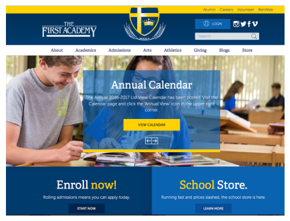
Nice, right?
Simple, crisp, visually appealing, and packed with information: a true winner in the eyes of current and future parents.
So let’s break it down.
As we talked about in this article, the best place to start guiding parents to the information they need is with a strong, easy-to-use navigation bar.
TFA has what’s known as a top-navigation bar, which means users will be able to direct themselves to the pages they need by clicking the links in the white bar at the top of the homepage (About, Academics, Admissions, etc.).
You don’t want to overwhelm parents with too many links so we recommend sticking to between four and eight pages that cover the categories that represent your most frequently asked questions and topics.
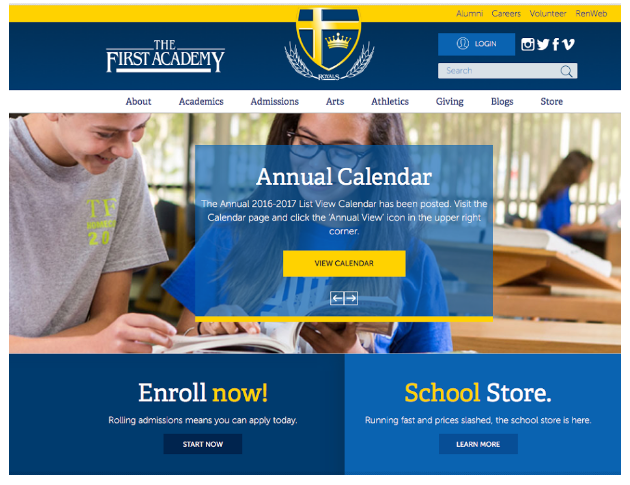
4. A Calendar of Important Dates
Using our example, make sure your school’s calendar is placed somewhere prominently on your website so parents don’t have to go on a search mission for it.
Every single event that’s happening at your school should be added to the calendar at least one month before the event is scheduled so parents have time to arrange their plans. Continually update your calendar so events are well-attended and not ignored.
TFA places a scrolling box for parents to easily find the annual calendar right on the homepage, but they also made sure to add it to their About section, along with another important piece of intel: their school’s contact information.
5. Detailed Contact Information
You probably have your school’s address, main phone number, and email address somewhere on your website, but does that really direct parents to the right contacts they need to speak with?
Take your contact page to the next level like TFA does:
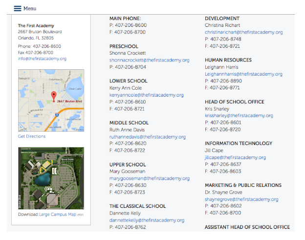
They embedded Google Maps so visitors can locate the school and get directions immediately, and they even added a large campus map for parents to download—pretty convenient.
As far as contact information goes, TFA has phone and fax numbers listed for the point of contact for every department, which makes it easy for parents to speak to the right person without getting transferred several (frustrating) times.
Adding email addresses for these contacts lets parents shoot quick questions over without ever having to pick up their phone—a helpful feature for parents who can’t get away from work to make a call.
6. Information About Enrollment
We already talked about How to Use Landing Pages to Increase Your Enrollment Rates, so we won’t waste too much time going over those details again today.
Basically, increasing your enrollment numbers means more funding for your school. Your school’s website should make the enrollment process as easy as possible for future parents.
TFA prominently displays their enrollment information right on the front page so potential parents can’t miss it:
7. Grade-Specific Updates
Busy parents are so used to personalized alerts and newsfeeds that they don’t have time to sift through information that isn’t pertinent to their lives.
This is why school administrators from large K–12 schools have a hard time connecting with parents. The news and events for third graders is drastically different from the upcoming dates that parents of juniors need to know.
TFA covers all their bases. When you hover over the Academics link in the navigation bar, a menu appears to give the user a virtual road map to the most relevant information they’re looking for depending on the age of their child.
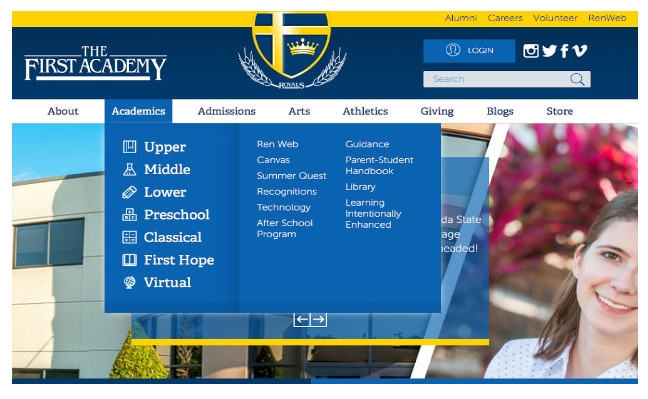
You’ll see links for all ranks of students, plus others relating to academic life such as library information and after school programs, all just a click away.
Parents in the digital age want their children in technology-focused environments. Show them that your school emphasizes and embraces smart communication and new technology with a great website.
Now that you know what parents are really looking for, re-work your website keeping these tips in mind.
To start, think about the most frequently asked questions your administrative staff fields on a daily basis. Make a list of these categories (i.e., immunization records, sports tryouts, school closings, etc.) and use them as the basis of your navigation bar.
When your website starts to gain more visits, keep visitors on your site longer by adding content in the form of blogs, celebrated student work galleries, etc. Your website will be a one-stop destination for parents interested in your school all over the virtual world.
[content_upgrade cu_id=”4171″]Bonus: If you need help conducting an audit for your school’s website, subscribe now to receive this free, easy-to-use guide![content_upgrade_button]Click Here[/content_upgrade_button][/content_upgrade]