Are you struggling to increase your school’s enrollment rates? Are you frustrated by the lack of progress you’ve seen from traditional marketing methods, such as mailing out postcards or hosting local fundraising events to bring awareness about your school to your local community?
Unfortunately, this is a common situation that many school administrators face. But it doesn’t have to be this way. It certainly shouldn’t feel as if you’re constantly trying to sell your school to local parents.
If you’re not seeing new batches of students signing up to attend your school next year, you may want to consider a different route. Boosting enrollment rates should be as simple as positioning your school as the right choice for parents, so they believe their child will be missing out academically if they don’t attend your school the following year.
If that sounds too good to be true, we’re here to show you that it is in fact possible. Given the right tactics and updated marketing methods, you can drive interested parents to your school, and it won’t feel like a constant uphill battle (we promise!).
The key is to create high-converting landing pages. Don’t be nervous if you’re unsure about what landing pages are or how they work — we’ll show you exactly how to do it in today’s article. We know that marketing is probably not your thing so we’ll keep our tips simple and easy to follow. By the end, you’ll have a surefire way to increase your school’s enrollment rate without becoming trapped in sales-mode to do so.
[content_upgrade cu_id=”2129″]Bonus: For additional tips on creating the perfect landing page, check out this helpful one page guide before you get started.[content_upgrade_button]Click Here[/content_upgrade_button][/content_upgrade]
What exactly is a Landing Page?
In the digital world, a landing page is simply a page that any website visitor can “land” on via a web search, hence the name. Think about a typical Google search you’ve done a countless amount of times. The user (or parent in our case) types a topic of their choosing into the search bar (‘grade schools near me’, for example) and they’ll see a list of results that contain specific relevant websites. These sites are filled with information relating to the keywords that they typed in the search bar.
What makes a landing page different from a traditional website page is that these are “a standalone web page distinct from your main website that has been designed for a single focused objective,” according to Unbounce. This means that there’s no top navigation and usually one call-to-action guiding visitors to make a specific move, such as signing up to learn more or starting the enrollment process, in our case.
In its simplest form, you can think of a landing page as a digital flyer that lives on your website. It contains all of the important details about your school, yet it’s written in a condensed and impactful way (similar to a paper mailer or flyer you’d send out). Towards the end of the page, parents will have the option to immediately sign up for the enrollment process or simply input their email address to learn more.
When done correctly, each visitor (or parent) chooses to take action right then and there. Once that happens, your website will keep a tally of every parent that provided their information and compile your very own database of qualified leads, or potential new students who are interested in enrolling.
How to Create High-Converting Landing Pages
Whenever you create a landing page, it’s important to identify the goal of the page first, so that every aspect is focused on hitting that goal. Since we’re talking about increasing your school’s enrollment rate, we’re going to assume that this is the goal for the page. The idea is to get parents to sign up right away, or at least sign up to learn more.
Here’s how to make sure that happens:
Step 1: Identify Important Keywords
Before you dive into creating your landing page, you’ll need to brainstorm a few important keywords that relate to your school. So if you’re a Montessori school in New York, you’d want to include those specific keywords in your landing page.
To get you started, here are some common keywords to focus on:
- The type of school: Montessori, private, charter school, etc.
- The grade level: high school, middle school, upper or lower primary, grade school, etc.
- The location of your school: you can use the zip code, city, state, and county as starting points
Remember, you want to use keywords that parents are likely to use when they search for schools nearby. Imagine for a second that you are a parent looking to enroll your child in a school close by. You may type in something like ‘Montessori schools near 10804’, for example, so it’s crucial that these keywords are somewhere on your landing page, so they’ll come up when parents are performing a web search.
To be clear, you don’t want to “stuff” your page with these keywords everywhere just to increase your school’s chances of popping up in results. It doesn’t work like this. Instead, you just need to include this important information as an organic part of your content.
Step 2: Display Important Details Prominently
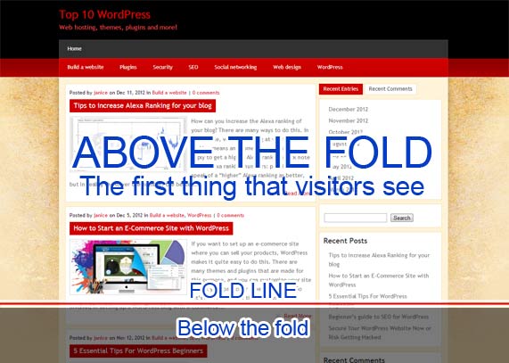
In marketing, when someone lands on a website, they’re greeted with a display of information “above the fold”. This is the area that’s visible before the website visitor has to scroll.
Ideally, you want your most important information displayed above this line. Here’s an image of what that looks like using this great example from Top 10 WordPress:

For this to work well, you’ll need to brainstorm your biggest “selling points” about your school and you’ll want to display them prominently above the fold. If your class sizes are small, or you offer advanced classes, you’ll want to mention those points here.
You’ll also want to include your contact information on your landing page. Your school’s phone number, local address, and email address should be listed just below the fold for easy contacting.
Step 3: Add Buttons & Enrollment Boxes
You’ll need to add a call-to-action button via a sign-up box that captures parents’ information, so you can begin building your database of leads.
Here’s what that looks like using another great example:

In this example, there is one bold statement (Create Your Future) with a smaller, supporting sentence just below it. A contact box is also displayed prominently (orange box) so students can easily add their information to learn more.
Just below this, you’ll find more information about the school, the services offered, and some helpful tips. This is a nice, simple template layout you can adopt for your school by tailoring it to reflect the unique features your school has to offer.
Keep in mind, this should ideally fit above the fold, so you may need to choose a smaller image and opt for less boxes on the contact form (two lines instead of four; name and email address only, for example). The amount of space you have available will depend on the layout of your specific website.
Finally, you can have parents start the enrollment process right away from your landing page. To do this, include an ‘Enroll Now’ button either in the top right corner of the header or just below the contact form. When parents click this button they should be directed to a separate page that includes the enrollment form. This way, parents can get a head start on the paperwork for you.
Once you’ve tackled all of these points, you’re ready to hit publish and send this page out to the world. In a few weeks, you should begin to see some parent email addresses start to trickle in. If you’re having any trouble here, our dedicated team at Hubbli will be glad to offer their helpful tips and guidance.
Now that you understand how easy landing pages are to create, it’s time to design your first one to increase your school’s enrollment rates. We’re certain that you’ll find a boost in your school size in no time.
[content_upgrade cu_id=”2129″]Bonus: Do not forget to download our one page guide, packed with tips to help you create the perfect landing page.[content_upgrade_button]Click Here[/content_upgrade_button][/content_upgrade]

